Heroes and Villains
My newest body of work started in July of 2007, is still influenced by the following story:
Shuzan (shou-shan 926-992) once held up his shippe* to an assembly of his disciples and declared: Call this a shippe and you assert; call it not a shippe and you negate. Now do not assert nor negate, and what would you call it? Speak! Speak! One of the disciples came out of the ranks, took the shippe away from the master, and breaking it in two, exclaimed, What is this? - D.T. Suzuki, Introduction to Zen Buddhism.
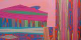
I am working within the restrictions of birch plywood, allowing the wood grain to provide the lines and shapes of the composition. I try not to alter the pattern of the grain, but instead use color to activate and alter the perceived composition of the wood grain, by using harmonies and contrasts to minimize and accentuate particular areas. After the first few I noticed I was repeatedly combining a saturated red and a saturated blue to clarify the most distinct forms I could find in the wood grain. At the time, I was watching Superman Returns on DVD when I had to take feeding and play breaks with my 6-month-old son. This led me to start considering the Red and Blue forms as Heroes, and after some research I learned that the majority of Superman’s enemies are often clad in Purple and Green. Using these simple color combinations to identify the more striking shapes found within the wood grain encouraged me to invent implied narratives in each panel.
To keep the colors from becoming too predictable I have started using 1980’s Superman comic book covers as the source of my palettes. I chose the 80’s, the time of my teenage years and Military Service, because Good and Evil were still being described to us in Black and White. The Cold War was still in progress, and we had a clearly defined enemy. Comics were drawn and written in those terms as well, and the colors were saturated and vibrant. As I develop these ideas further, I plan to delve into the comics of the 1990’s and 2000’s for sources of color palettes. At that time in comics, Good and Evil becomes more nebulous, often existing in a gray area in between, and the colors become more deep and neutral.
I am also influenced by the overall composition of the comic book page, and have recently started to build my structures with multiple sheets of plywood in varying shapes and sizes, changing the direction of the grain from panel to panel. I am intrigued by how comic artists use the size and shape of each panel to depict time and space, to speed through time, or linger on a moment, and I think such a device could be interesting to use in non-objective painting.
There is a misconception that to be a good artist you have to be completely original, but being original just means looking at your existing world in a creative way. I am combining the world of construction (the birch panels) with the world of comics (the panels and colors) to create interesting, and maybe even original paintings. And who knows...maybe along the way I’ll rid the world of Evil... only time will tell.